
Build on a
Strong Foundation

TokenPx brings together universal design tokens and curated UI components built on the same system, helping teams design consistently without guesswork.
The foundation we built for real products is now yours to use.
Most design token systems look great in a talk or a blog post.
Then you try to actually use them — in a fast-moving product, with a real team, under real constraints — and the cracks appear fast. Naming conventions that don't scale. Structures that made sense for one platform but break on another. Token sets so bloated that onboarding a new designer takes longer than it should.
We built TokenPx Universal Design Tokens because we kept hitting those same walls.
Not as a UI kit. Not as a rigid, opinionated framework. As a structure-first foundation — designed from the ground up to work across real products, real teams, and real platforms.
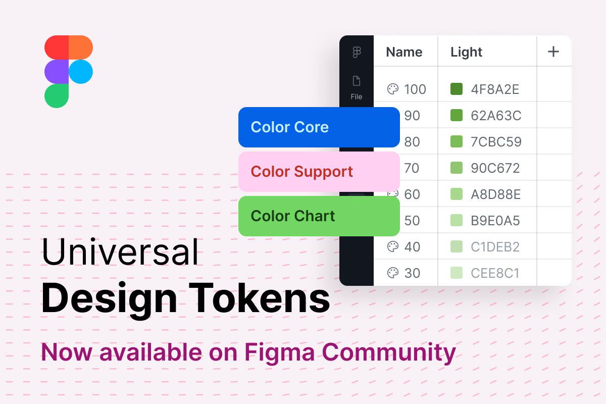
That foundation is now available on Figma Community.
From Idea to Real Usage
We didn't start by designing a token system. We started by noticing the same breakdown happening across products — inconsistent values, drifted styles, decisions that lived in someone's head instead of the system.
The goal was straightforward: build a token architecture that solves those problems before they start. One that's practical enough to use from day one, but structured enough to scale for years.
What's different about this release is simple — it moves from concept to real usage, real projects, and real teams. You can duplicate the file right now, and start working with it today.
What's Inside the Foundations File
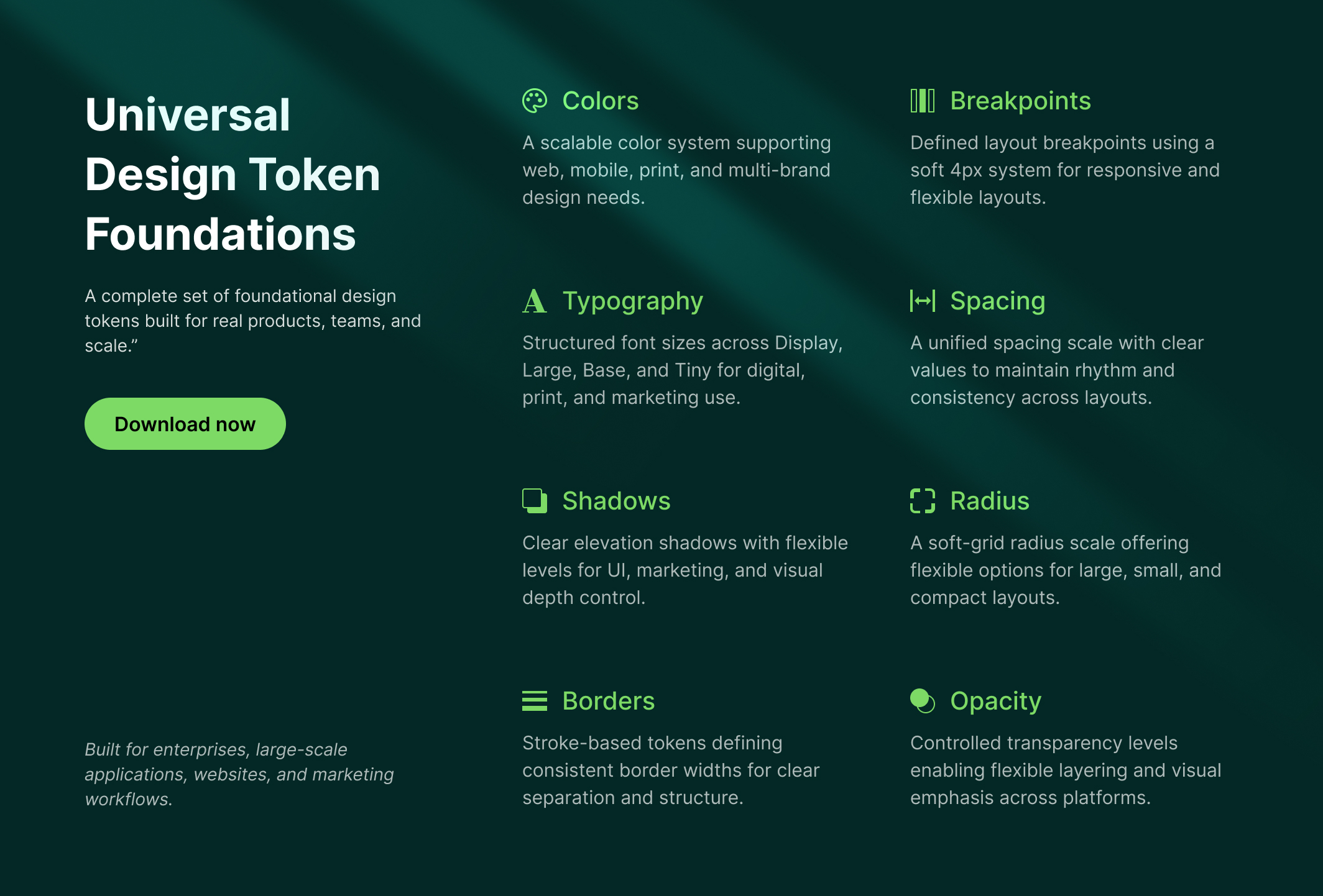
TokenPx Foundations (TokenPx-Foundations-v01) ships as a single, lightweight Figma file containing a complete set of universal design tokens:
- Colors — Core, Support, and Chart palettes
- Typography — Size, weight, line height, and letter spacing
- Spacing — A consistent, scalable spacing system
- Grid & Layout — Structure for any screen size
- Shadows — Elevation levels that match real UI depth
- Radius — Shape control across components
- Border widths, Opacity values, Z-index — The smaller decisions that add up
Every token is built using Figma Variables, making the whole system reusable, extendable, and workflow-ready from the start.
And because none of these tokens are tied to a specific component or framework, you're never locked in. Use them with your existing component library, a custom one, or no library at all — the foundation works either way.
A Color System Built to Scale — Not to Survive
Color is where most design token systems quietly fall apart.
Not immediately. Not on day one. But as the product grows — new features, new themes, a rebrand, a second product line — the color structure that seemed fine at the start becomes the thing everyone works around instead of with.
We know this because we lived it.
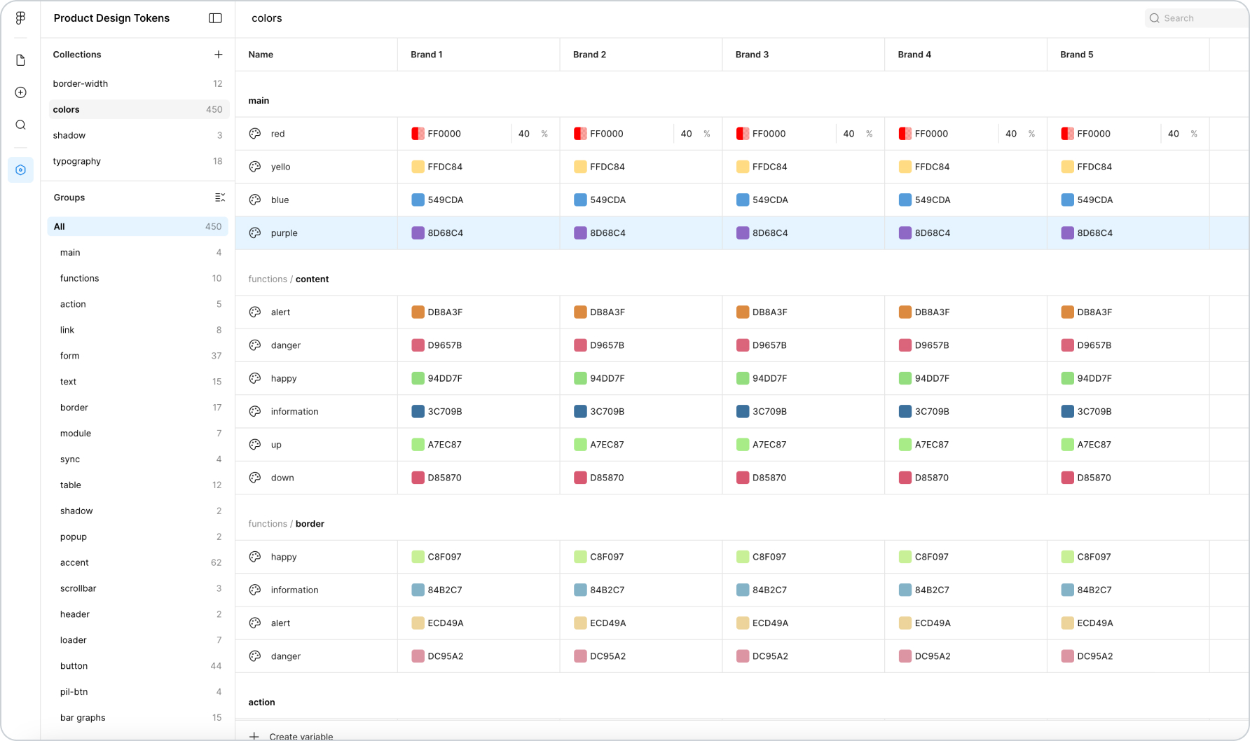
This is what a color token system looks like when it grows without architecture. One flat colors collection. 450 tokens. Group names coupled to specific components — pil-btn, bar-graphs, sunburst, tab — baked directly into what should be a foundation layer. Multi-brand support attempted by adding columns (Brand 1, Brand 2, Brand 3, Brand 4, Brand 5) to an already overcrowded structure. Token names like creative, fun, power, calm that carry meaning in one product context and mean nothing to anyone else.
It works. Until it doesn't. And when it breaks, it breaks everywhere — because everything is coupled to everything else.
That system was built through real work on real products. It wasn't a mistake — it was the natural result of a color system that was never given an architecture to grow into. We spent a significant amount of time studying exactly where and why it failed, running experiments, and rebuilding from first principles. The goal was a structure that could scale to any size — without ever needing to be rebuilt again.
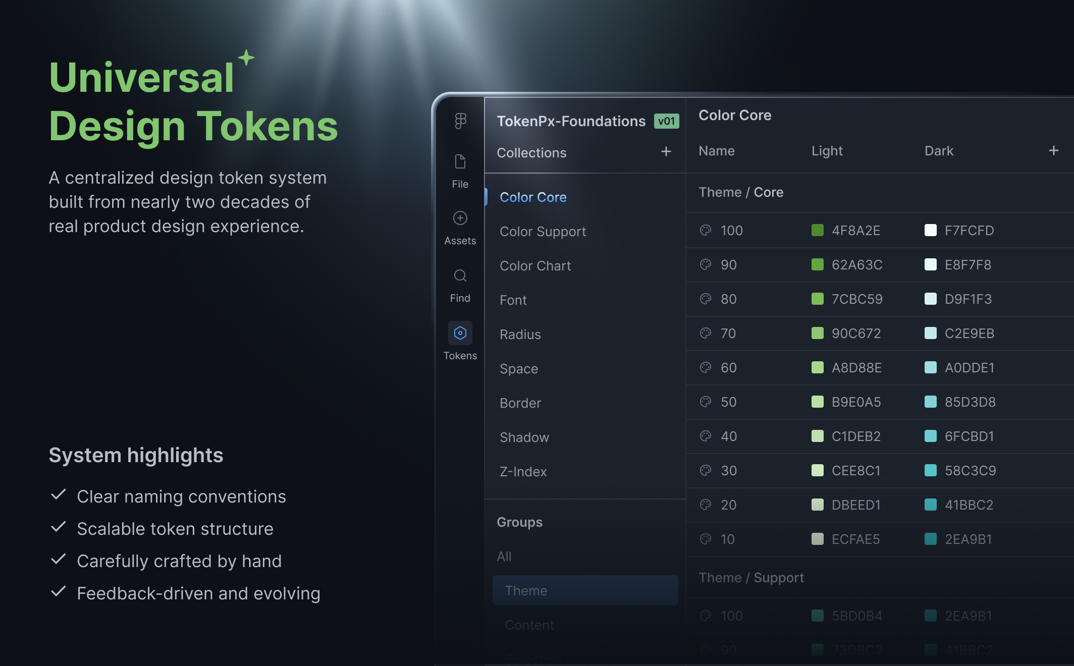
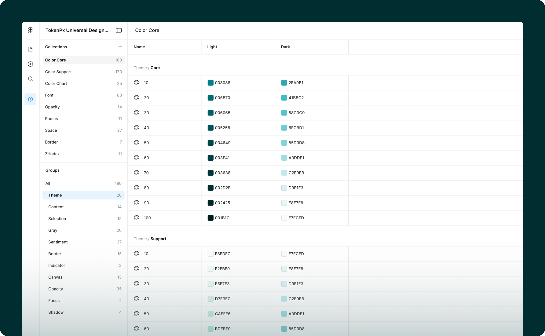
The result is how TokenPx approaches color: three distinct collections, each with a specific job.
Color Core — 180 tokens
The structural foundation. Every token here serves a semantic role in the UI — not tied to a specific component, not named after a product feature. Color Core is organized into clear groups: Theme, Content, Selection, Gray, Sentiment, Border, Indicator, Canvas, Opacity, Focus, and Shadow. Every group carries full state coverage — Default, Hover, Focus, Active, Disabled — in both Light and Dark mode. This is the layer that everything else references. It never changes shape as your product grows; it only gets applied differently.
Color Support — 170 tokens
Extended color decisions that complement the core without polluting it. When a product needs additional color roles — accent families, extended brand expressions, supplementary UI color — they live here, cleanly separated from the structural foundation. Adding to Color Support never risks destabilizing Color Core.
Color Chart — 25 tokens
A completely dedicated data visualization palette. This exists because chart colors have fundamentally different requirements than UI colors — they need to be distinguishable from each other at small sizes, work across light and dark contexts, and never be confused with sentiment colors like error red or success green. Keeping them in their own collection means your chart palette can evolve independently without touching anything else in the system.
This three-layer separation is the architectural decision that makes multi-branding possible without chaos. When a new brand needs to be added, you're not unpicking a flat list of 450 tokens and hoping nothing breaks. You're applying a new brand expression on top of a structure that was designed to receive it. The foundation stays intact. The brand layer sits cleanly above it.
No component-coupled names. No product-specific labels embedded in what should be universal. No flat lists that collapse under their own weight.
Just a color architecture that was designed — from painful, hard-won experience — to scale.
Truly Agnostic — From a Button to an Enterprise Platform
Most token sets are quietly coupled to a specific component library. The spacing assumes certain button padding. The radius values are tuned for a particular card style. The color system was designed with one UI framework in mind.
TokenPx Universal Design Tokens was built with a different constraint: no assumptions about what you're building.
These tokens are not tied to any specific component — no Button, no Tooltip, no Popup, no Text style. They're a pure foundation layer. That means you can apply them to:
- A simple landing page
- A complex SaaS dashboard
- A large-scale enterprise application
- A multi-brand product suite
- Marketing materials and print collateral
And when you're ready to scale into multi-branding — different visual identities sharing the same structural foundation — the token hierarchy supports that without a rebuild. You add a brand layer on top. The foundation stays intact.
This is what component-agnostic actually means in practice: the system grows with your product, not against it.
No T-Shirt Sizes. No Guesswork.
One deliberate decision in TokenPx that designers notice immediately: we don't use t-shirt sizing.
No XS, SM, MD, LG, XL. No arbitrary labels that force you to memorize what each one means in pixels — or worse, guess.
Instead, every token carries its actual value in its name. Take line height. Rather than naming it line-height-lg and hoping you remember what that maps to, TokenPx shows it as 88 [72], 84 [68], 80 [64] — where the number in brackets is the exact font size it pairs with. The relationship is embedded in the name itself.
This means a designer picking a line height token immediately knows:
- The exact line height value
- Which font size it's designed to work with
- No cross-referencing. No documentation lookup. No guesswork.
It sounds like a small thing. For anyone who has spent time hunting through a token list trying to figure out which line height pairs with which heading size, it isn't small at all.
The same thinking applies across the spacing scale, typography sizes, and every other token category — real values, meaningful names, relationships made visible.
Built From Real Products — Validated Against Real Screens
This is not an auto-generated token set. And it wasn't designed in isolation.
While building TokenPx Universal Design Tokens, we simultaneously designed actual production-grade screens — full application interfaces, websites, marketing pages, and print materials — using the same tokens. Every structural decision in the system was validated against real UI scenarios before it shipped.
That process matters more than it might sound. It means:
- Spacing values were tested in real layouts, not just on a spacing scale diagram
- Typography tokens were validated across actual content hierarchies — headings, body, captions, labels — in real screens
- Color tokens were stress-tested across light UI, dark UI, data-heavy dashboards, marketing hero sections, and print contexts
- The system proved it could handle everything from a simple marketing site to a complex application — before you ever opened the file
Generated systems can give you coverage. This one gives you judgment — built the way a senior design system engineer would build it, proven in the same moment it was created.
Built on a 4px Grid — Every Pixel Intentional
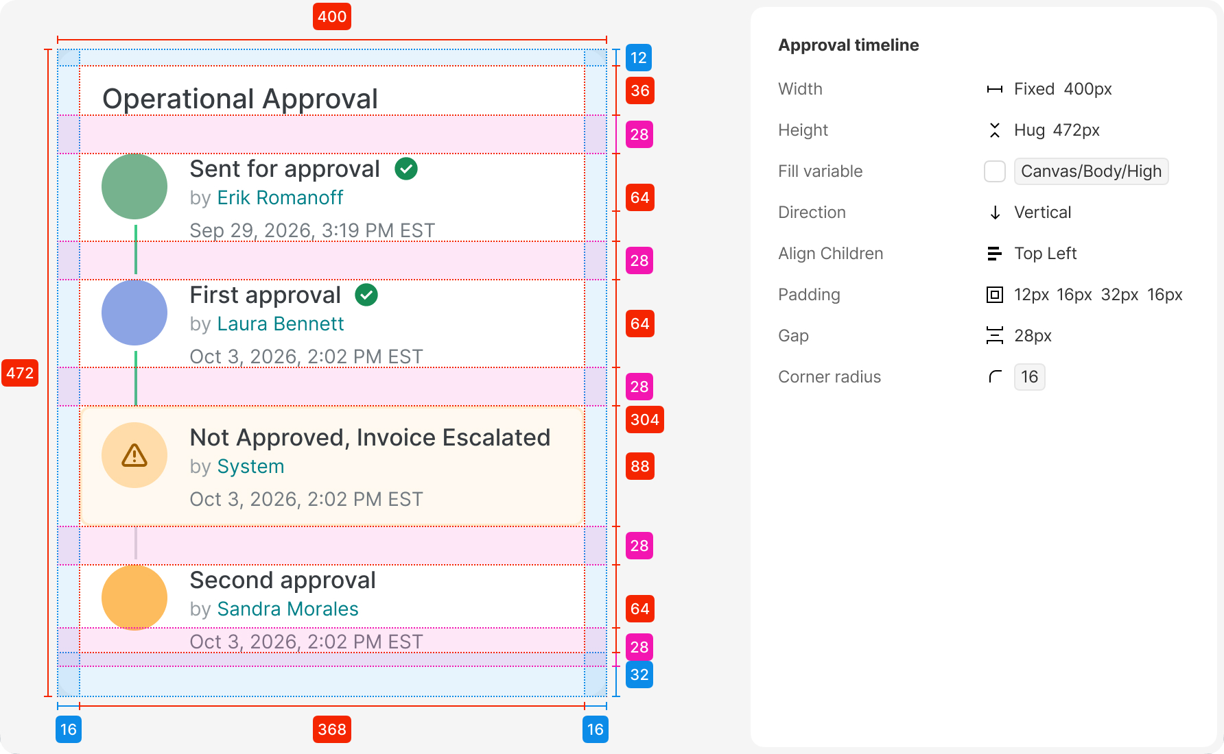
Every component in TokenPx is built on a 4px base grid. Not approximately. Not mostly. Every spacing value, every height, every padding, every gap — divisible by 4.
This is not a stylistic preference. It's an engineering discipline applied to design.
A 4px grid means:
- Components align naturally when composed together — no 1px nudges, no "close enough"
- Spacing tokens map cleanly to the grid, so designers and developers are always speaking the same unit language
- Layouts stay consistent across breakpoints because every value in the system is mathematically compatible
But the 4px grid is only half of it. The other half is how components are constructed internally.
Every micro-element — an avatar, a status dot, a checkbox, an icon container, a tag — is built as its own atomic component first. Then those atoms are assembled into larger components. A dropdown isn't drawn from scratch. It's composed from a search input atom, a list item atom, a section header atom, a footer action atom — each one individually token-referenced, each one reusable on its own.
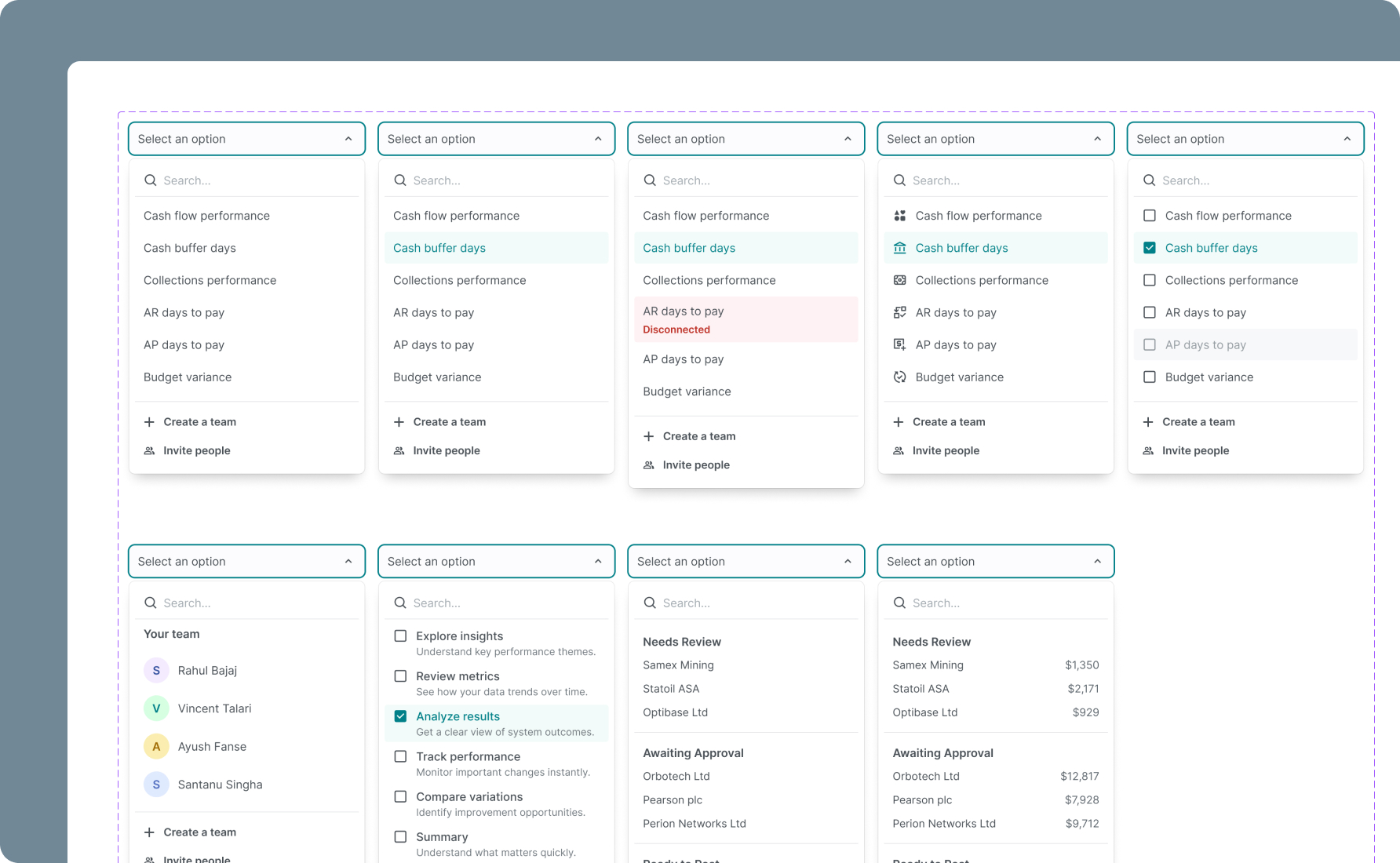
You can see this in practice across the components. The Timeline component covers every possible state — empty, active (in-progress), completed, and error — in both horizontal and vertical orientations. The Dropdown component has four real-world variants: a people selector with avatars, a multi-select with descriptions, a grouped list, and a grouped list with values. The data card components handle financial data, warning states, multi-category breakdowns — all built from the same atoms, all on the same grid.
This is what "atomic" actually means when it's done properly: not just a naming convention, but a construction method. Every large component is traceable back to its smallest parts, and every smallest part is grounded in the token system.
The result is a component library that doesn't just look consistent — it is consistent, structurally, all the way down.
Every Component State, Accounted For
One of the fastest ways to tell whether a design system was built for real production use or just for demos is to check the states.
A button isn't one thing. It's at minimum six things: default, hover, focused, active, disabled, and loading. An input field has default, focused, filled, error, and disabled. A dropdown has open, closed, selected, and empty. A list item has default, hover, selected, and disabled.
Most Figma component libraries ship the default state and maybe hover. The rest get improvised by whoever picks up the file — inconsistently, without tokens, in a hurry.
TokenPx components ship with every meaningful interaction state defined, named, and token-referenced:
- Default — the resting state, baseline for everything else
- Hover — responsive to cursor interaction, clearly distinct without being jarring
- Selected / Active — communicates current context or choice
- Focus — keyboard navigation state, visible and accessible
- Disabled — visually de-emphasized, non-interactive, never just "opacity 50%" guesswork
- Error — integrated with the color token system, consistent across every input-type component
Every state is a deliberate decision, not an afterthought. And because every state references tokens — not hardcoded values — changing the hover color system-wide means one token update, not hunting through hundreds of component variants.
This is what makes a component library production-ready: not the number of components, but whether every component is finished.
Built to WCAG Standards — Contrast That's Never an Afterthought
Accessibility is one of those things that's easy to say and hard to actually build in from the start. Most design systems address it late — after the color palette is set, after the components are built, when changing contrast ratios means unraveling decisions made months earlier.
TokenPx was built with WCAG (Web Content Accessibility Guidelines) contrast compliance as a constraint from day one — not a pass applied at the end.
Every text color token in the system was validated against its background context:
- 4.5:1 minimum contrast ratio for normal text — AA standard
- 3:1 minimum contrast ratio for large text and UI components — AA standard
- Color pairings in the token system are intentional — semantic tokens like
text.primary,text.secondary,text.disabledare mapped to background tokens they're designed to work with
What this means in practice: when you use a TokenPx text token on its intended background, you're not guessing whether it passes contrast. It does. The decision was already made, already tested, already built into the system.
This matters most for teams who ship to enterprise clients, government platforms, or any product with accessibility requirements — but it matters for every product. Accessible contrast isn't just a compliance checkbox. It's the difference between text that's readable in sunlight on a mobile screen and text that isn't.
You shouldn't have to audit your design system for accessibility after the fact. TokenPx makes sure you don't have to.
How to Adopt It Without Disrupting What You Have
You don't need to rebuild your entire system to start using TokenPx. The adoption path is intentionally gradual:
Step 1 — Start with Foundations
Apply tokens for colors, typography, and spacing first. These are the values that drift most in teams without a system, and the highest-impact place to start.
Step 2 — Map to Components
Connect your tokens to buttons, inputs, and layout containers. This is where the consistency starts to become visible.
Step 3 — Introduce Alias Tokens
Layer in semantic meaning — surface, on-surface, primary-action — without breaking the primitive structure underneath.
Step 4 — Scale Across Projects
Reuse the same foundation across multiple products, teams, or platforms. The system is built to travel.
To make those first steps easier, the file also includes essential UI components built on the same token foundation. They're not prescriptive — they're reference points that show the tokens working in context, so your team can understand the system by seeing it in use, not just reading about it.
Designed to Stay Lightweight as You Grow
One thing that kills token systems at scale is token bloat — a file so large and complex that onboarding new contributors takes days, and making a change means cross-referencing a spreadsheet.
TokenPx avoids this deliberately:
- The Foundations file stays lean — just the core layer
- Advanced components and patterns ship as optional add-ons, not bundled into the base
- The structure separates concerns clearly so complexity only enters when you actually need it
The result is a system that performs well, onboards fast, and scales without becoming a maintenance burden.
Who It's Built For
TokenPx Universal Design Tokens is for anyone building with system-thinking in mind:
- Product designers who want a professional-grade foundation without building from scratch
- Design leads and managers who need to enforce consistency across contributors
- SaaS and enterprise teams dealing with multi-brand, multi-platform complexity
- Developers working in token-based workflows who need a Figma source that's export-ready
- Freelancers who want to show up to every project with a system, not a blank file
Start with Universal Design Tokens
Available for free on Figma Community — a structure-first foundation handcrafted and validated across real products, platforms, and teams.
